 Previously we’ve done two types of articles for each issue of White Dwarf and No Quarter magazines. We’ve crafted our Quick Picks and Inside series for each of the periodicals to help you decide the value in purchasing a particular issue. Our Quick Picks series highlight five of the best content pieces in each issue. The Inside series provides the table of contents and broad musings for each issue.
These series are being accompanied by a new member of the family. First Glance will provide our initial reactions to an issue. The First Glance articles will be composed as we peruse the issue for the very first time. As such the writing may be rougher than usual yet the realism will be enhanced. The raw thoughts will offer a truer unbiased and original response. Our first glance will address preparation (including production and publishing of the issue), visuals (the aesthetic appeal), content (value and volume), and value (is the issue worth your money).
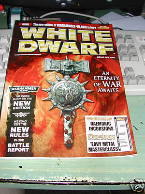
We are kicking off the First Glance series with White Dwarf #342 for July 2008.

Cover: The cover is very appealing with the red hues and the war hammer on the front. It is easy to see what articles GW thinks is important. Clearly 40k is the focus of this issue as evidenced by 40k words, images, and slogans plastered across the cover.
Editorial: The flavor of the month continues as Mark Latham writes this month’s editorial. He says “I’ve been so distracted by my evergrowing Warhammer armies that I’ve neglected Warhammer 40,000.” In the next breath he rushes to say “…Warhammer 40,000 is more than just a set of rules” and “Warhammer 40,000 is here, and that means war!” So put down the LotR models they told you to use last month and dig into futuristic combat. Nice photo on the preceeding page.
New Releases: They look really nice and highlight the new 40k items. I love the 40k counter set and $15 is a steal. But, I think $90 for both the collector’s and gamers’ editions of the 40k rulebook are astronomical. I hope GW made yet another typo when they printed those prices. The moonscape is back huzzah for all and $17 is a great deal. I love the look of the Dark Elves Spearhead unit but $192 is beyond belief even for GW. They better be made of pure oil.
40k: The 40k coverage is extensive to say the least but that’s expected in the issue devoted to hyping gamers into a frenzy to buy the new edition. That said I’m a man who loves maps and I love the map on pages 32-33. If there’s one thing GW does well it is visuals. High scores for the visuals in this issue. The Batrep is in depth, pleasing, and well written.
WFB: Yay there’s quality Fantasy content in the issue. I feared they would forget to include it. The Daemonic Incursions article is a blessing and worthy read. Take it into the restroom while you vacate last night’s gaming diet of pizza and energy drinks.
Toolbox: How the heck is the Battlemat an entry for the monthly toolbox article? Using the term tool very loosely I suppose we can fit the mat in there. But if we’re defining terms that loosely we may as well just revert to calling the Earth a cube again.
LoTR: The Mordor Troll is one of the ugliest models I have ever seen. So…kudos? Not really sure if GW intended to make it that abominably ugly or if it is an unexpected byproduct like when Red Hood fell into that vat of chemicals and emerged as Batman’s arch nemesis.
Battlezones: This new section has won me over. I’m a total fanboy when it comes to well made terrain but who isn’t? There are great ideas in this section and the guide to making a gaming table, I feel like I’ve seen this in every other gaming outlet in existence, is quite helpful.
Event Calendar: There are some great events happening in Massachusetts. July 12th will be a busy day with a 40k 400pt Combat Patrol happening at Rising Phoenix Games in Cherry Valley. Then there is a 2k Team Apocalypse 40k event at The Whiz Store in Westborough. Plus Off the Wall Games, in Hadley, is running a two-day linked 40k event on the 12th and 13th ending in a mega battle. So much time and so little gaming. Wait a minute. Strike that. Reverse it.
Back Cover: It looks like the August 2008 issue will be more 40k based on the incredible photo adorning the rear cover. Couple that with the quick reference sheet insert for the new 40k rulebook and I think this will be the summer of 40k.
Preparation: 7/10 The magazine is well put together and I had trouble spotting any obvious typos. There may be a few, however, and my issue had too much adhesive goo in the rear pages.
Visuals: 9/10 This is a stunningly beautiful issue. Wonderful photos adorn almost every single page. The visual beauty is enhanced by the 40k artwork.
Content: 8/10 There is a ton of content for 40k giving high marks to that. However, all other games have sparse coverage with Fantasy receiving the remainder. No real content is given to LotR or GW’s other games.
Value: 6/10 If you love and only play 40k this will skyrocket to 10/10. But, if you’re like me and enjoy multiple GW games you’ll be disappointed by the more than usual bias towards the flavor of the month. Fantasy and LotR players are better off keeping the $6 in their pockets.
Total: 30/40 C or 75% for the average of the four categories. The value definitely brought this down. If they included just one quality article on LotR and one less on 40k the overall score would have risen to a B- or 80%.
 On Sunday I picked up a new game, the Spore Creature Creator, in anticipation of the September ’08 release of the full Spore game. Spore is another Maxis title and Will Wright has been touting this for ages. I figured that the $9.99 price tag, at Best Buy, was worth the expenditure.


